Thursday, 31 March 2011

H-Frame and D.I.Y. Track


For the intro of the video we decided to have two still shots of two locations cross-cutting with close-up tracking shots of a female runner. With the still shots intercutting with the tracking shots, implicitly suggests the theme of the action from sports contrasting from the still city of London being awaken and brought to life by the Olympic Sports.


Track material list:
Heavy Duty Tripod

3 Meter Plastic Tubes x6
Wooden Spacers x9

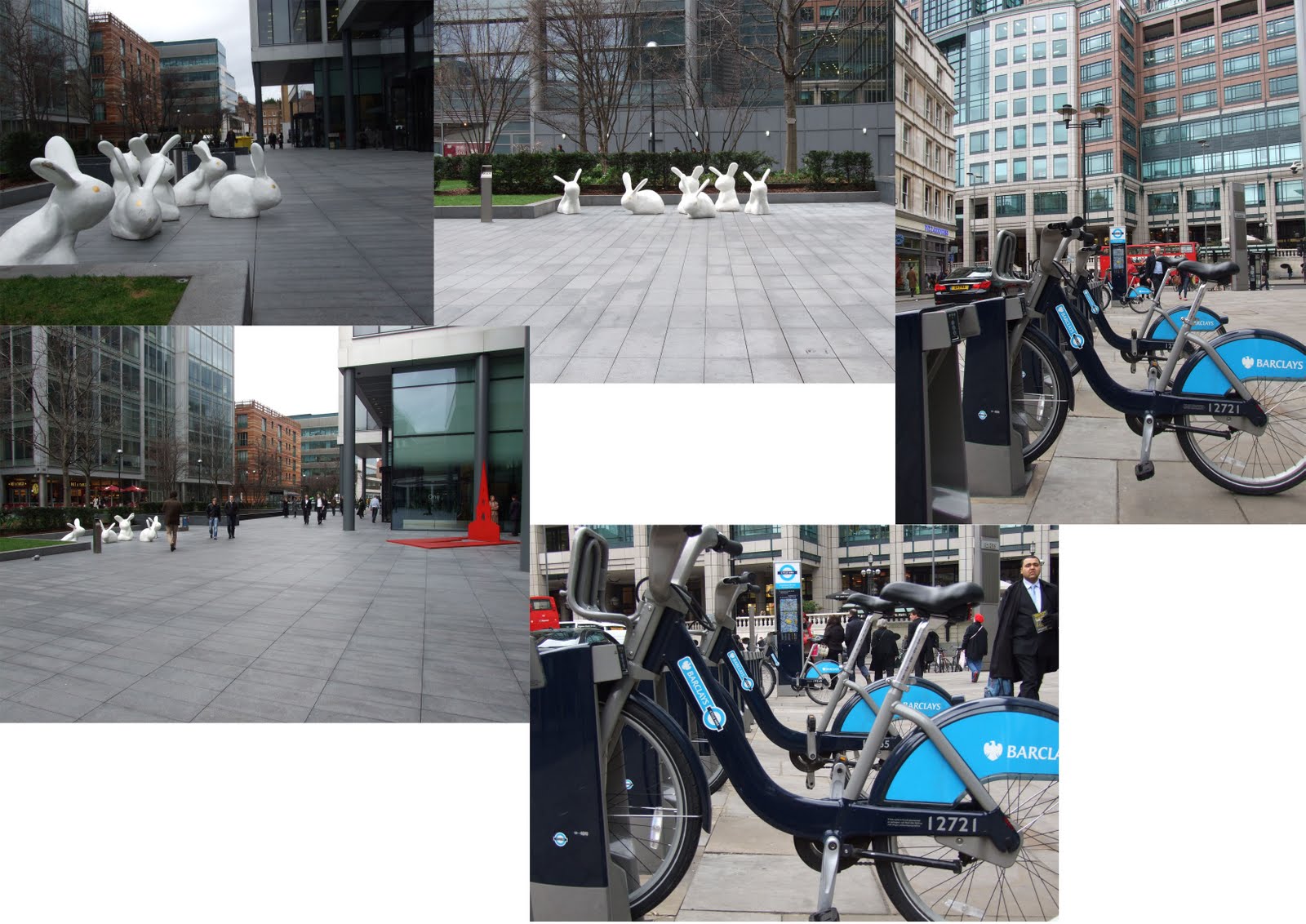
In order to do these tracking shots, we booked out the H-Frame from college and bought the items required to create the tracks from B&Q. The location for these shots were originally planned to be near the London Eye. We were unable to get a consent for filming in that location, also traveling with the tracks out is very expensive and time consuming. We decided to shoot them in the Millennium Village near North Greenwich due to conveniency. Another reason being the shots are so tight, the location would hardly be recognisable anyways.


This is a test shot of the track, which is a great representation our track's effectiveness.

Storyboarding


Above is the storyboard Reno and I discussed and later drawn properly by Reno. We planned out the animation from the angles of shots to various transitions thoroughly throughout the piece. However, a couple of transitions and certain bits had to be neglected due to heavy amount of work and lack of time towards the deadline as a result of our attempt of taking on two extra projects at the same time.

Locations


We selected three primary locations due to each and everyone of their own unique cultural differences: China Town, Brick Lane and Greenwich.
Before we initiate the storyboarding process, each location was scouted beforehand in order us to be more familiar with the location as well as the possibilities of various shots.


We discovered limitless amount of possibilities in China Town regarding the creativity and substantiality of the cinematography. The only anticipated problem is timing and obstacles because the main street is usually crowded at most times of the day, the deliveries trucks seem constantly parked along the side of the street as well. We hoped to absolve this problem via arriving at the location early in the morning.


After reviewing Brick Lane as one of the locations, we felt that the location lacks obvious quality of cultural recognition to it and hence might be difficult for the audience to relate especially for foreigners. As a result, we changed the location to Borough Market in London Bridge and added Camden as an extra location.


Beautiful and locally known Borough Market.


Camden is an interesting tourist spot which is somewhat less pretentious and commercial as the Big Ben and the London Eye we felt this could thus bring forth a more powerful cultural impact to the piece.

Animation Tests


Above imageries are tests done by Reno in order to create a stylistic 2D animation look by having the live footage with animated graphics on top. This demonstrates the potential look of the animated athletes as well as the environment. We decided to portray the footage in black and white then draw coloured animated graphics of the environment over it. As the characters throughout the city carry through their Olympic sports, the city in black and white could be coloured with animated graphics and eventually become fully animated in the Olympics stadium. This implies the idea of the Olympic sports bringing colours to the city as well as melting away from the cultural differences through colours.

Video Reference

These are examples of the visual references we found for the type of look we might be looking for.

Amsterdam Osdorp
by The QBF


Thought of You
by Ryan J Woodward


UN TOUR DE MANEGE
by alexis liddell

Animation Style

We started looking at a huge variety of styles of animation to see what might be more effective for this project.


2010 Winter Olympics in Vancouver. A series of sports are demonstrated nicely with smooth transitions. A very dramatic mood is well created with the action and music. The logo was creatively blended into the animation and thus well presented at the end.


2008 Beijing Olympics. The animation does not include a lot of sports but it adopts the Chinese literature story, Journey to the West, and enhances the cultural reference to the Beijing Olympics. Despite there are not a lot of sports reference to the animation, the narrative aspect is a success because it is difficult to incorporate a good narrative in short promos.


This is a good example of graphical animation working together with live footage. Despite that it stands out from the footage, but it is a good stylistic approach.


Illustration work created via image manipulation. This diverts from realism but provide a very stylistic look, which enhances the artistic feel to the piece as well as giving a more visceral and personal connection to the audience.


Above images are examples of great colour adaptation with creativity, which contributes to great responses from the audience on a visceral level.


A great use of hand drawn style illustration. The simplicity brings about a stylistic yet effective look to the piece.


These are great examples of cultural references which emulates our idea of referencing various cultures in London being brought together by the Olympics.


These are great demonstrations of various animation technique that are adopted in order to create stylistic looking animations.


Inspired by this technique, we were planning to have the animated characters leaving light trails as they are doing sports in the scene.


Above illustrations are great examples of live footage composited graphical animations. This resembles our idea of animated athletics on top of live footage of various locations.


Above images are the major examples that we have looked that. After we looked through everything, Reno then created a mood board of the few major styles that we were considering in order to make up our mind on the final decision.